
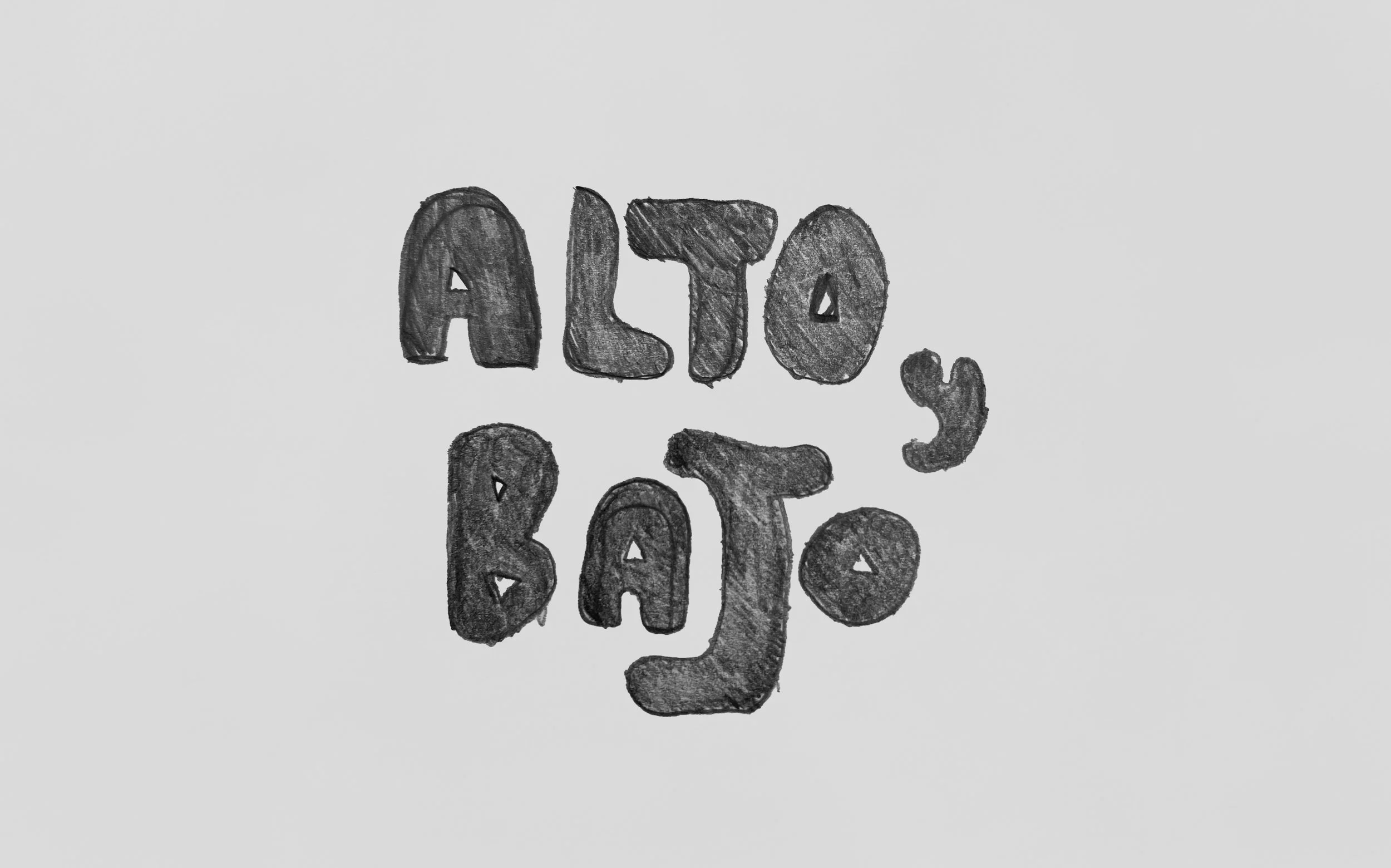
Alto y Bajo
THE CLIENT
In the summer of 2024, a new international supermarket named Alto y Bajo will open in Stavanger. The store will feature both physical locations and a parcel delivery service.
THE PROBLEM
Our task was to build a brand identity for an international supermarket that appeals to both Peruvians and Norwegians.
TARGET AUDIENCE
The target audience consists of Peruvians and conservative Norwegians, primarily around 60 years old, living in Stavanger. They enjoy “exotic” food but require a little encouragement to try unfamiliar options.

THE ROLE
As the designer, I was tasked with developing the design strategy and brand guidelines.
THE CONSTRAINTS
Research revealed that Peruvian and Norwegian design preferences differ significantly. Peruvians favor a maximalist design, while Norwegians prefer simple, minimalist designs. It was essential to create a design that resonates cross-culturally and fosters a sense of belonging for both communities.

KEYWORDS
Authentic, Quality and Inclusive
DESIGN PROCESS
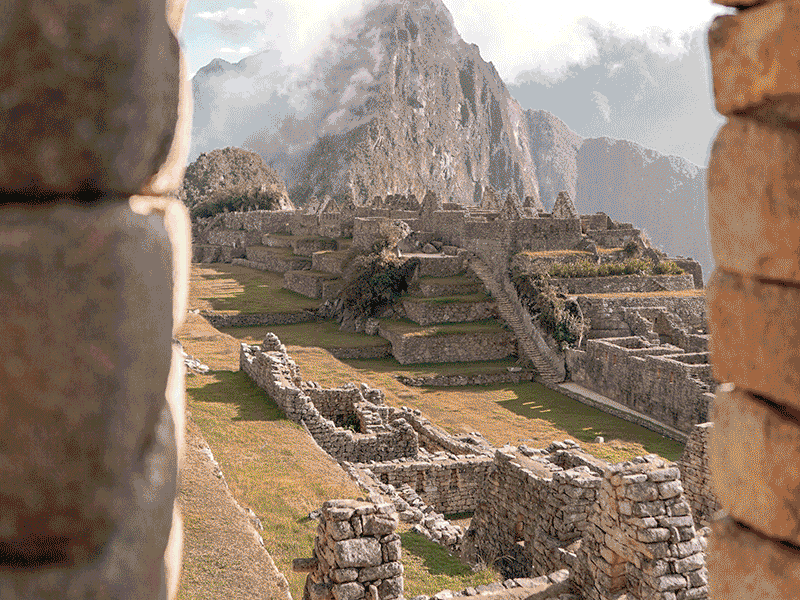
In developing the brand identity for Alto y Bajo, I began by exploring Peruvian culture and moving beyond common clichés like llamas and Machu Picchu to focus on the country's diverse topography. This exploration led me to conceptualize Peru as a vertical land of contrasts, which inspired the name “Alto y Bajo,” meaning “High and Low.”
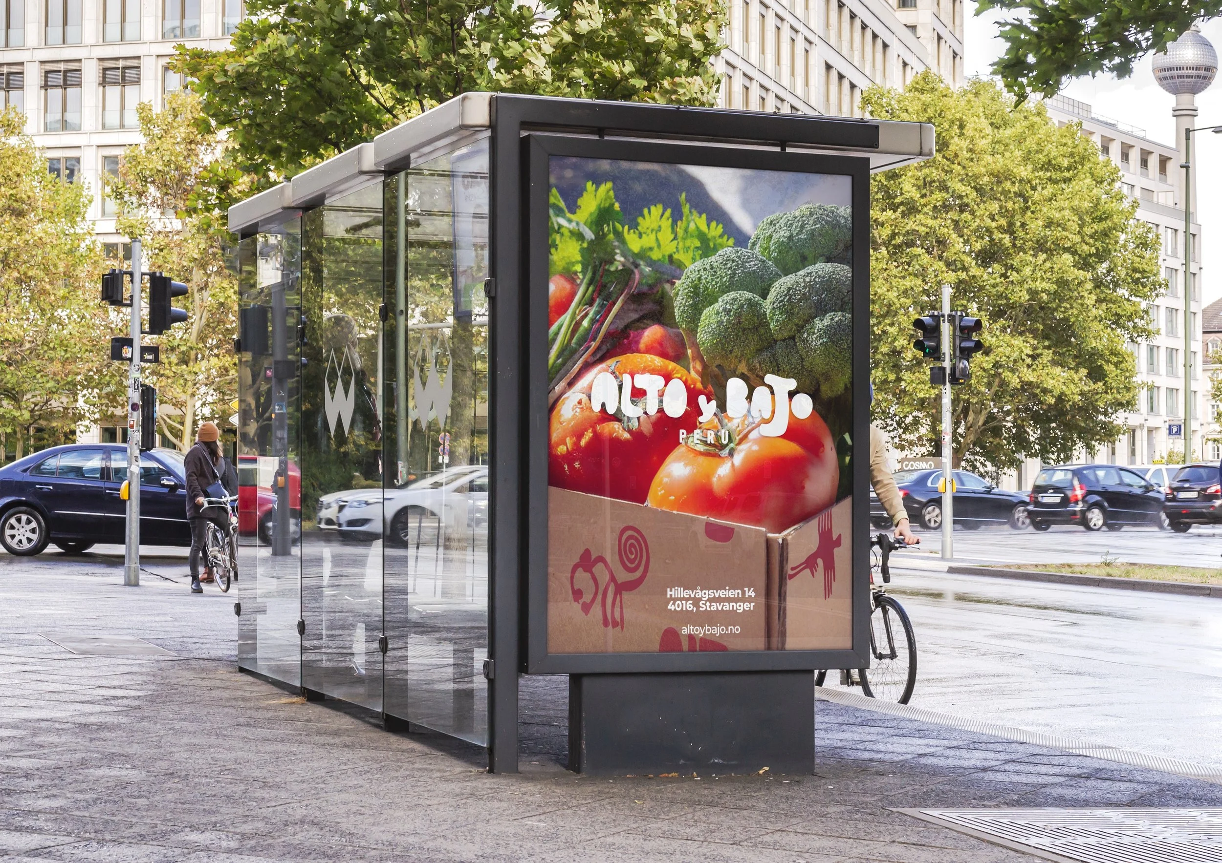
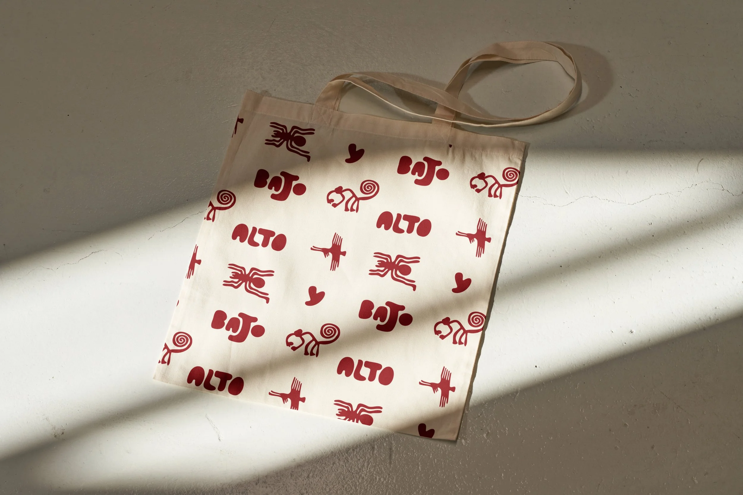
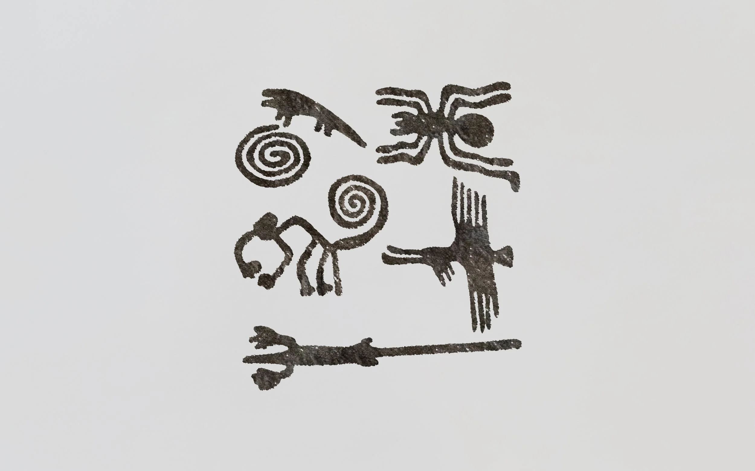
We ultimately chose to integrate the Nazca Lines—ancient geoglyphs from Peru—as the primary graphic elements. This distinctive choice added significant cultural depth to the design.
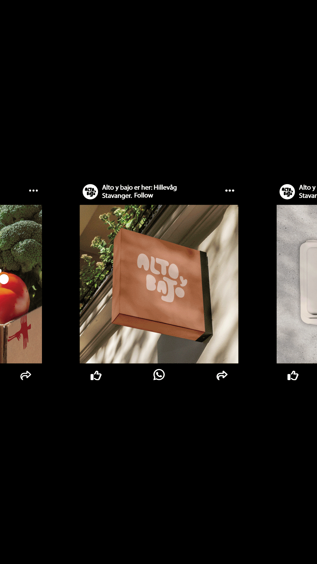
The final design features a playful logo complemented by a clean, modern identity using the Montserrat font. High-quality product photography enhances the overall presentation, contributing to a refined and exclusive look.
THE RESULT
The visual identity is inspired by the Peruvian heritage of its owner. A significant design element is the Nazca Lines, ancient geoglyphs located in southern Peru. By integrating these iconic patterns, the design pays homage to Peru's cultural legacy while maintaining a contemporary and engaging identity.
By combining playful and formal design styles, the identity presents the brand as serious and trustworthy. Emphasizing quality across all applications was key to appealing to Norwegian shoppers, with high-quality product photography playing a crucial role.


KEY LEARNING
One of the most important lessons was the value of creating a comprehensive design manual to ensure consistency across various platforms.
THE CONCLUSION
The blend of playfulness and structured design makes the brand appear professional and high-quality. Subtle nods to Peruvian traditions, such as incorporating the Nazca Lines, enrich the cultural depth while maintaining a fun and engaging identity.