
Become Your Future (WYRC)
THE CLIENT
White Horse City Council focuses on the well-being, activities, and development of its suburbs, with a strong belief that volunteering plays a key role in enhancing the community. They offer a variety of volunteering programs, advisory committees, and reference groups for people of all ages, providing opportunities to share interests, connect with like-minded individuals, and build relationships.
The specific program we collaborated with was the White Horse Youth Representative Committee, which is dedicated to young volunteers aged 12-25.
THE PROBLEM
Due to rising living costs and inflation, many locals are prioritizing work and income over volunteering and community involvement. This shift has led to a decline in volunteer participation, diversity, and overall awareness about the importance of giving back.

TARGET AUDIENCE
Our target audience for this project is young Australians aged 12-15, who are seeking to discover their purpose in life. They are eager to expand their skills, gain knowledge, and prepare themselves for the future.
THE RESULT
By encouraging young individuals on their future purposes. Whitehorse Youth Representative Committee aims to deliver a unique and valuable program to Australian youths aged 12-15 years with the skills and knowledge to equip them for their future. This in turns, allow parents to benefit off of the free extracurricular during cost of living knowing that their kids are gaining valuable skills and abilities to become future ready.

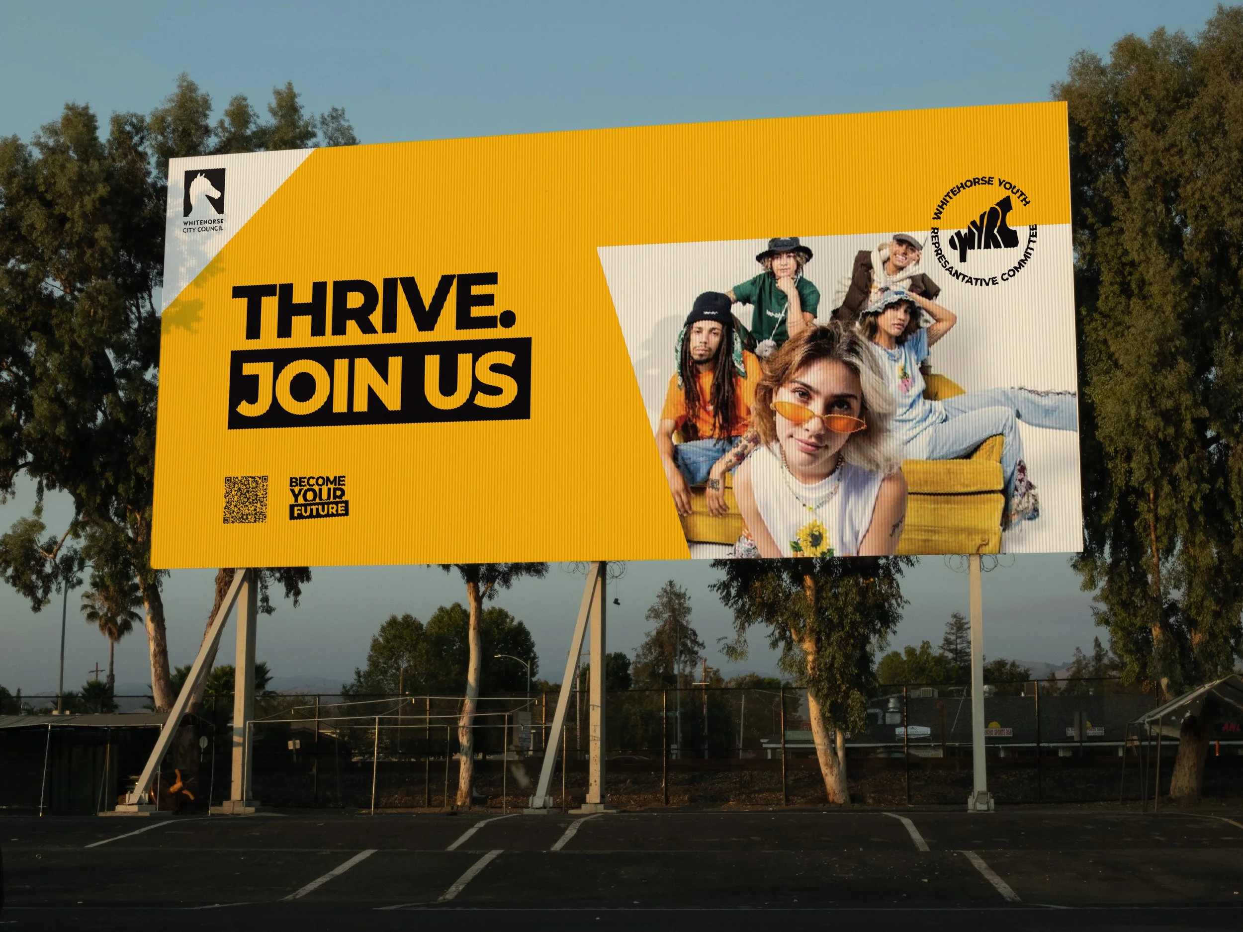

CAMPAIGN POSTERS
Our initial campaign posters embraced a minimalist design, utilizing a bold color from our brand palette to capture attention. The acronym "WYRC" was creatively masked with dynamic imagery to resonate with our target audience. By incorporating visually striking elements, we sought to create a sense of connection and intrigue, inviting viewers to engage with our message. The logo mark, paired with the tagline "Become Your Future," served as a strong call to action, encouraging individuals to embrace their potential and the opportunities ahead.
This design was then adapted for billboards to ensure consistency across formats.
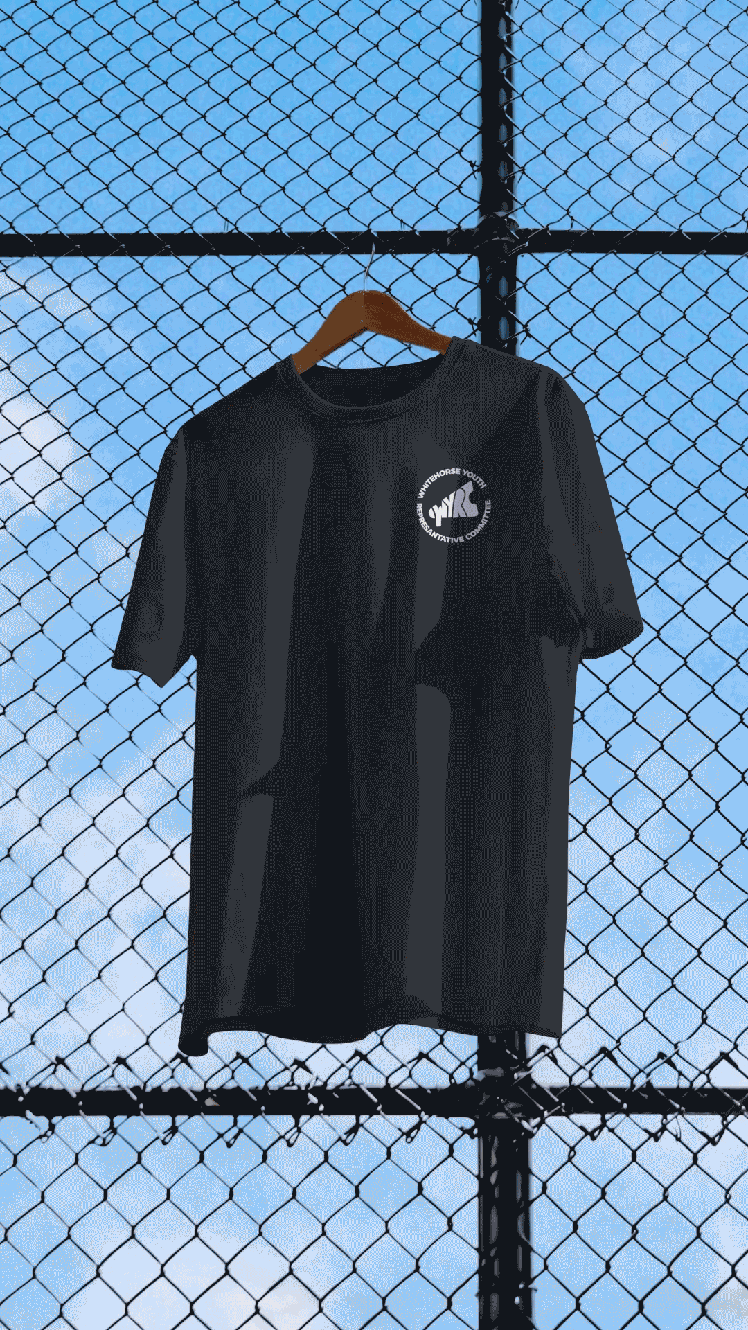
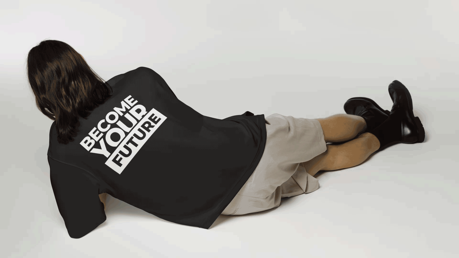

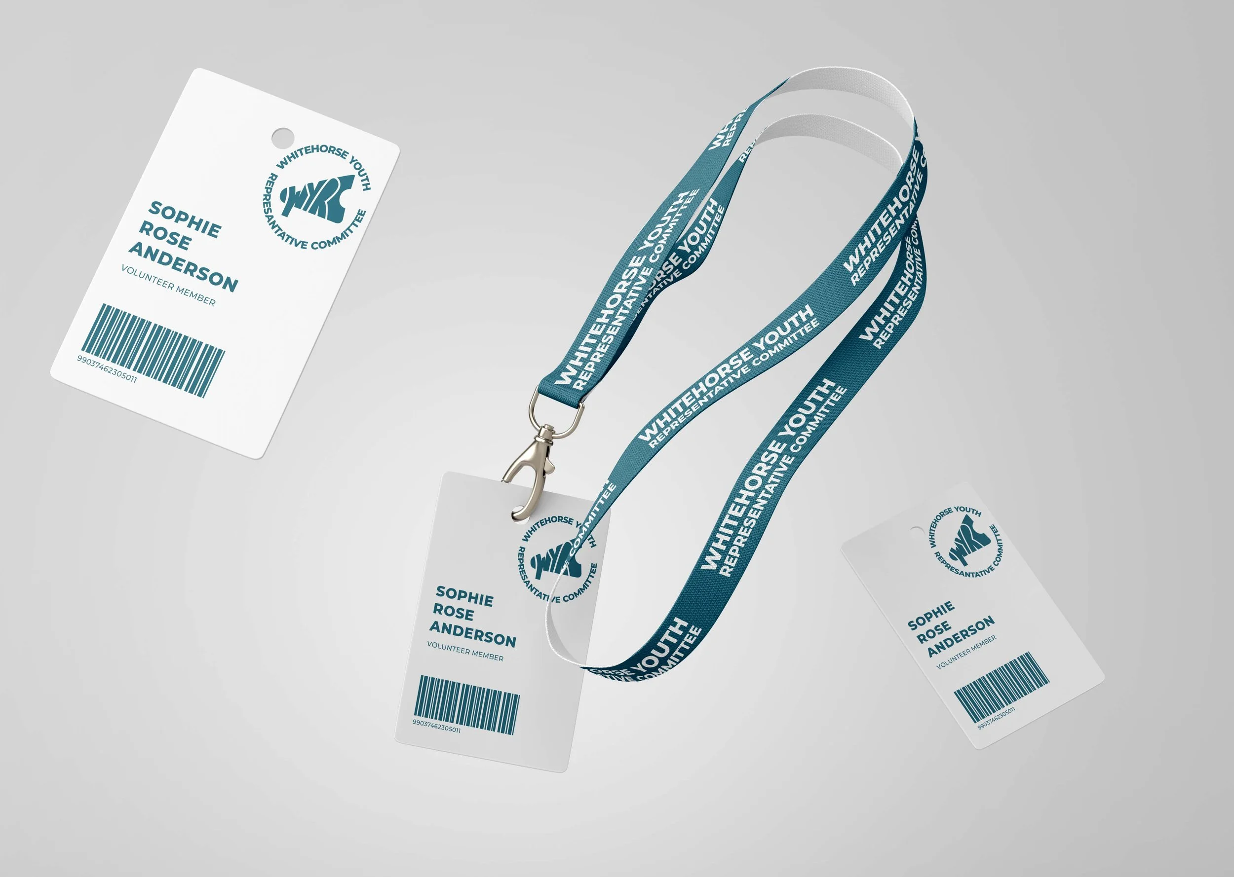
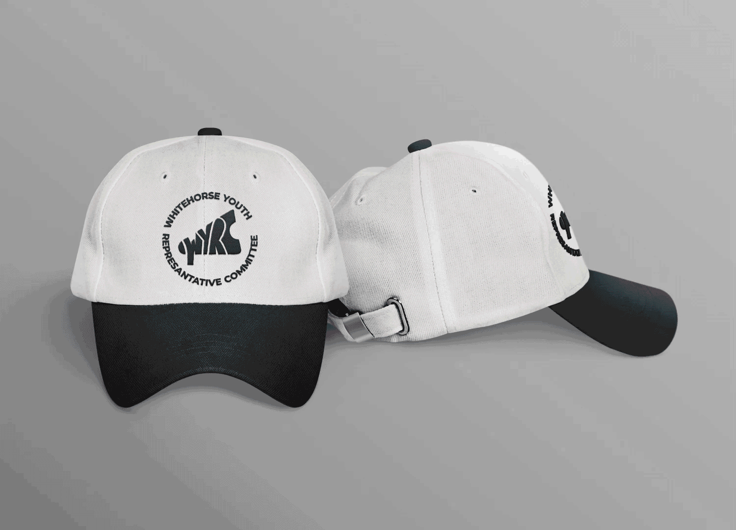

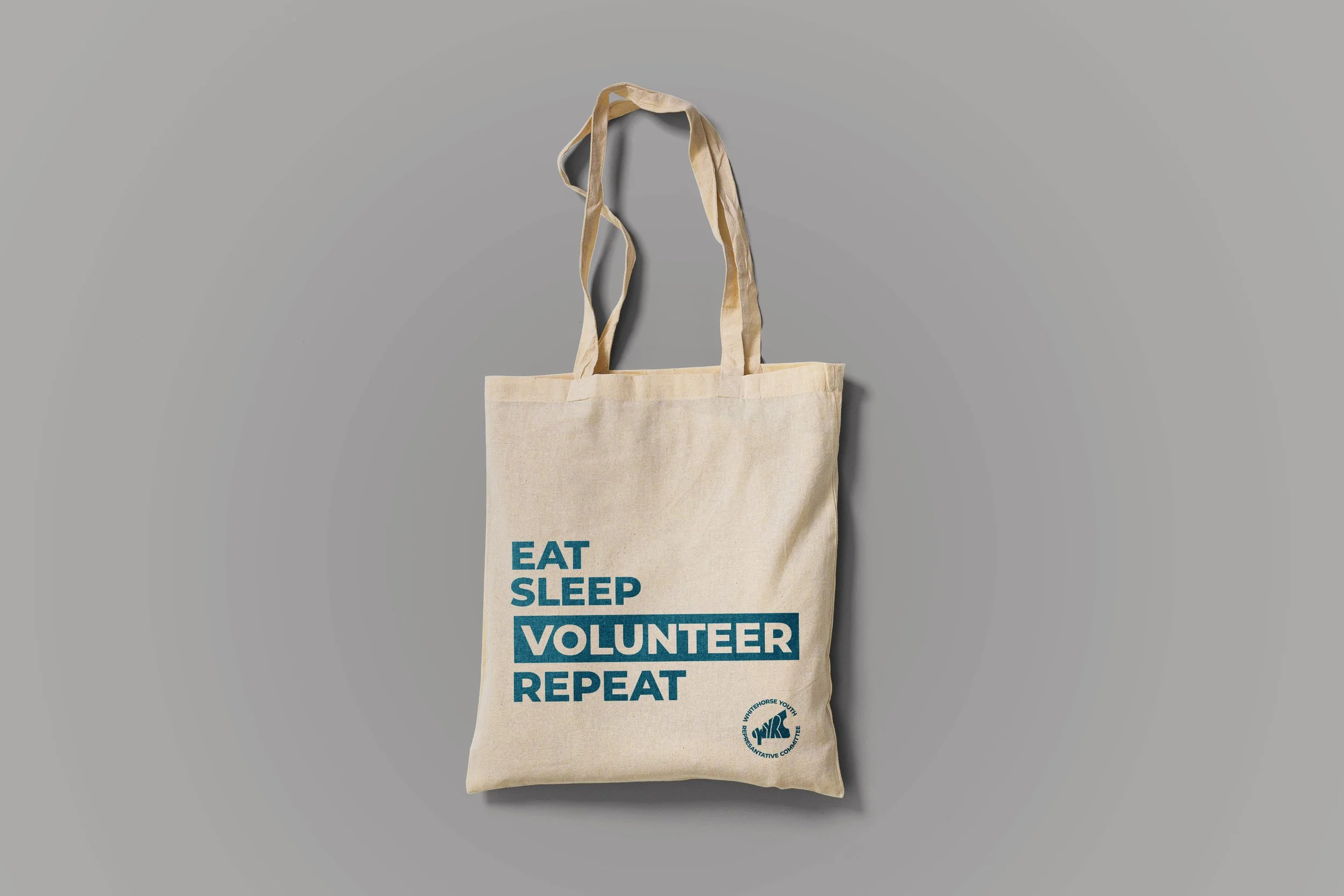
MERCHANDISE
To maintain the cool, urban look and feel, we used bold text and a sans-serif typeface across the merchandise. The vibrant, youthful colors from our palette were also incorporated to resonate with our volunteers. Additionally, we emphasized key words by placing them in squared boxes, ensuring they stood out and carried more significance.
Our goal was to design merchandise that our target audience would feel proud and comfortable wearing, allowing them to represent the program while engaging in community services.